Online Marketing Solutions for More Leads - Landing Pages
What are Landing Pages? Landing pages exist to convert website visitors into leads. They're one of the most vital elements of inbound marketing, and...

Your homepage is a powerful component for your company and frequently gives potential clients their first impression. Your website serves as more than just a digital business card; it often serves as a portal to your organization. As a result, there are numerous crucial elements of successful web design, such as white space, font choice, color schemes, and layout, but the content of a website, not its appearance, is what matters most. Your homepage must briefly describe your product or service and persuade visitors to explore more of your website.

Your logo should be visible at the top of your website. The logo is an essential component for customers to recognize and associate with your brand because it is a physical representation of your goods or services. You want the logo to be in a prominent place within the header of your website because it frequently serves as a link to the homepage.
Meta Tags are brief sequences of text that can describe a web page's contents and go beyond simple keywords. To be most successful, each page should have its own distinct Meta tags. Although Meta Tags are hidden within the page's coding and are not visible to the average user, Google's powerful, constantly changing, and all-seeing algorithm never misses them. Meta Tags set correctly are a key technique for Google to ensure that the pages it recommends to consumers are full of high-quality content. Provide evocative alternative text for photographs as well. This is yet another excellent SEO "hack" that improves the accessibility of websites for screen reader users.
Another essential element that should be on your website's header is simple, straightforward navigation. If your website has a lot of content, adding a search box might be helpful. The menu's items should be simple to find and understandable to new visitors. The navigation area serves as a road map for visitors, providing a summary of the material and guiding them to the most appropriate location to find the information they seek. Reduced bounce rates are a result of descriptive and detailed navigation, and this all aids in Optimizing search engines.
Your website must convey to visitors what you have to offer in just a few seconds. Your company's name, what you do, and what you offer should be clearly stated in your headline and any subheadlines or paragraph text. This usually consists of 1-2 phrases of language that is compelling, memorable, and focused on the needs of your audience.
Your website's homepage should capture visitors' curiosity and encourage them to explore more of your website's pages. One technique to attract visitors to the internal pages, start the selling cycle, or at the very least, establish direct contact is by using a call to action (CTA). To contact forms, subscription signup forms, or other pages on your website that offer further information, CTA spaces or buttons can be linked. The visitor is more likely to spend time researching your website if you make it simple and interesting for them to click this CTA.
Another effective strategy for building confidence and showing your skills is to offer testimonials or client/customer feedback. The social proof demonstrates to prospective visitors your expertise and offers crucial information about your good or service. The power of success tales to create a positive first impression. Testimonials on video are preferable. Certainly, they demand a little bit more time and money, but the interaction can have a lot more profound effect!
People are visual, to put it simply. Because the audience can relate to it more than a still image of your product, a photo or video of someone using your product or engaging with your service is preferable. Our eyes are drawn to human faces and we connect with the emotion we see because of the way our brains are programmed. A website's credibility and integrity are increased by its use of photos. Seeing your product or service in use can increase its credibility and integrity, and when done properly, it also has the added virtue of being "evergreen"
The language of your site matters. It is best to describe what you do and connect it to why it matters to the visitor. Keep your content simple and easy to read and avoid industry jargon by being conscious of your target audience.
Arguably just as important as your header navigation is your informational footer. Three components should be available here after your visitor reaches the bottom of your homepage: links, social media integration, and contact details. The presence of contact information encourages a visitor to contact you. Links can be a helpful approach to offer a quick sitemap or persuade visitors to explore internal pages. Giving visitors a chance to interact with your business on social media is a terrific method to increase website traffic. Also, it gives you another way to engage with others and communicate while increasing your social proof.
We have all the tools you want at our disposal thanks to a full staff of designers, developers, copywriters, and experts in digital marketing!
Global Reach can design and implement creative solutions that are sure to provide your visitors with a first-rate experience, whether you're wanting to completely refresh your brand identity, build an updated content strategy, or bring to life a new tool that will deliver value to your audience.

What are Landing Pages? Landing pages exist to convert website visitors into leads. They're one of the most vital elements of inbound marketing, and...

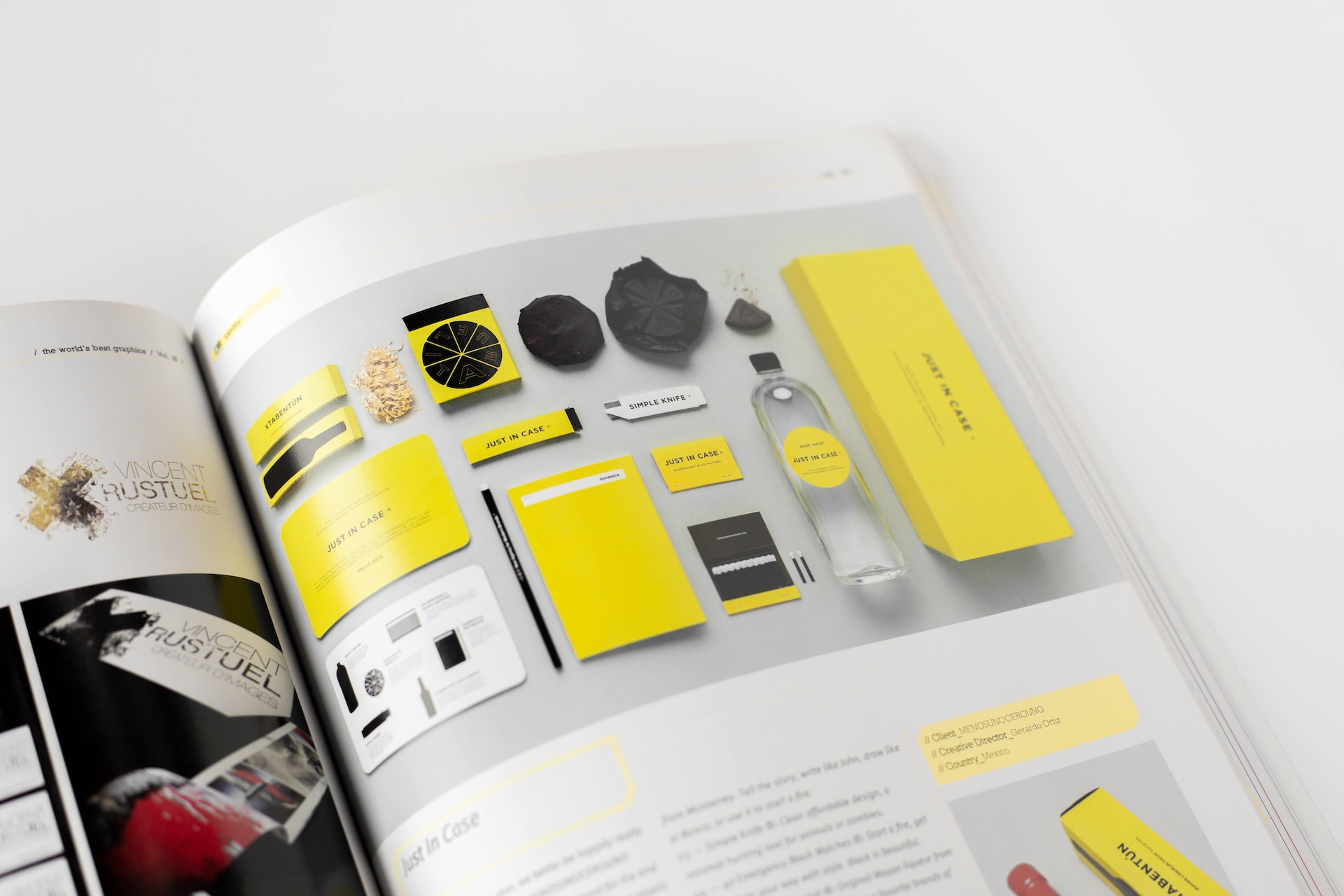
What is 'Brand Identity'? Creating a comprehensive message for your organization, product, or service including names, logos, taglines, business cards