Monika Godia

Why is a logo important?
Logo making is important for a company because it is the visual representation of the company’s brand. It is the first thing that customers will see when they come across the company’s products or services. A logo can help to create a strong and lasting impression on customers, and it can be used to differentiate the company from its competitors. A logo can also be used to create a sense of trust and loyalty among customers, as well as to communicate the company’s.
What elements make a logo successful?
Before you set out to create your own wordmark logo, let’s review what makes a good one.
Simplicity : A successful wordmark logo should be simple and easy to recognize. It should be able to convey the company’s message in a few words or symbols.
Legibility : The font used in the logo should be legible and easy to read.
Color : The colors used in the logo should be appropriate for the company’s brand and message.
It’s just quirky and unique enough to be memorable.
3 Easy Steps to Create a Wordmark Logo
By using the steps below, you may design a memorable wordmark logo for your blog without making a significant time or financial commitment.
1. Who is your target audience- Choose who you want to contact by learning about their basic demographics, such as gender, age range, income, and level of education. If you're uncertain, try to estimate who you wish to attract.
- Consider the demands this group has. What are the problems they face, and how do they live their daily lives?
- Find out which businesses or brands your target audience currently values and relies on. Who do they admire? Then why? You can use this as inspiration for your wordmark design.
- Knowing these details about your ideal reader will make it much simpler to develop a visual identity that appeals to them. You'll be able to express your answer to them since you'll be aware of their demands.
- For instance, younger readers of a technological blog might anticipate a sans-serif font (like Helvetica) and vibrant, "young" colors.
- A more mature audience reading a blog on investments could anticipate a serif font (like Georgia) and "corporate" hues like dark blue and green.
2. Choose a typeface that reflects the style of your Logo.
The font you choose matters a lot when your logo is a wordmark. The visual component will convey your brand personality the most effectively.
By giving your brand personality traits, you can explain what your blog or company stands for and humanize your brand.
Your font selection will be simpler if you know who you want to appeal to as well as the personality you want to convey.
Focus on readability : Whether used as a watermark on an image or in smaller sizes, your wordmark must be readable.
Don't trust the regular suspects : Avoid using the default fonts on your computer, such as Times Roman, Helvetica, Georgia, Verdana, and the rest. These lack the charisma to support your brand.
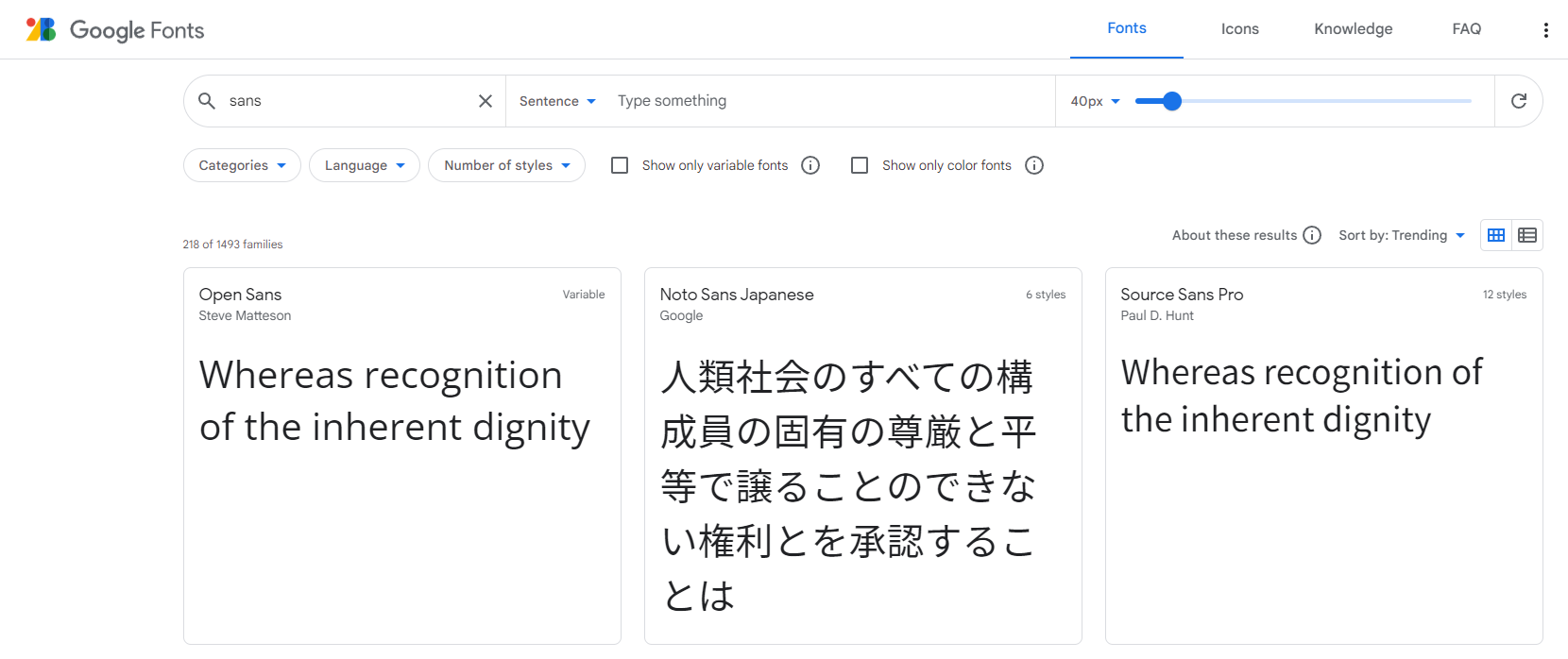
To choose the font to use for your wordmark, Google lets you inspect and compare various typefaces.
3. The vibe of a brand's expression is defined by colors.
Emotions are strong and can influence how people make decisions. Colors are necessary to evoke powerful emotions in customers, which is something that brands aim to do but cannot do with simply a logo.
- The number of colors in your brand's color scheme should be specified.
- Find complementary hues using the color wheel.
- Understand how color palette and brand personality are related.
- Discover the ideal brand colors for your sector.
- Know your brand color codes.
So there you have it! As you can see, having a logo is essential to creating a successful brand and business. Yet creating a professional logo doesn't have to be difficult.


The significance of colour for brand identification and your website
Without the proper color knowledge, selecting the right colors for a website or brand can be difficult and time-consuming. Some businesses rely...